The photo of me was taken by a camera. I then transferred the photo from the camera to my computer. I opened the picture in paint and put it into grey scale. Then I colored the blotches of white and gray on my skin, with the paint tool and the grey, white, and black colors. After I did that, I moved the picture into Photoshop and filtered with poster edges. I repeated this process about three times. I then colored the background a blue color so there was some color. This process was so that we would learn to use paint, and Photoshop. This picture is not available because there was not enough room for it on my H drive.
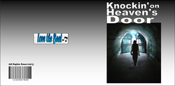
Front side
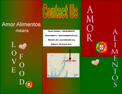
For this project we were assigned to make a personal trifold. We had to pick a business and we had to explain why we started the business, when we started it, and so on. The tri-fold had to contain a picture of yourself. First we took the picture are put it into grey scale. Then we put it into paint and colored it with grey, black, or white. Next, we moved the photo into Adobe Photoshop and filtered it with poster edges. Then we placed the photo back into paint and started this process over again. I did this processes twice. After that I put the picture into my trifold and explain why i started the business and what inspired me. I chose the colors for my trifold because they are the colors of the Portuguese flag. On the side of the trifold I balanced out the paragraphs with the picture.
Back Side
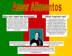
If I were to change anything about this project it would be to try to make the picture looked like it was drawn. I could fix this by filtering it more or by using a different type of filter.
Front Cover
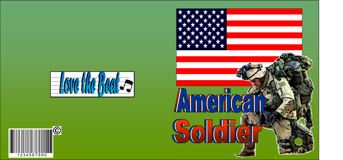
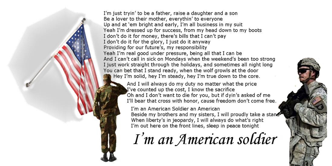
For this project we were assigned to make a cd cover for any song. We were restricted on what we could put on the cd, such as we couldn’t put a picture of the artist or band. We had to depict the lyrics in the pictures we used. The song I picked to make a cd cover was American Soldier. This song is about how a soldier has a tough life but they have to fight through everything and stay strong. For the front cover, I used an American flag with a soldier on one knee. I put both pictures in Adobe to edit them. The soldier I used poster edges to edit it. For the American Flag, I just made the colors in the flag darker. For the background on the front cover I used green to make the soldiers uniform pop out. I set the American flag behind the soldier. For the words American soldier I used word art. I made three word arts that said “American”. I made them red, and blue to represent the American flag. I then sent them behind each other so that the word would have more depth. I repeated that step for the word “soldier” too. Then, for my inside cover I put two soldiers, one saluting the American flag and one looking at the lyrics of the song. For both of the soldiers on the inside cover, I edited them in Adobe Photoshop by filtering them into poster edges and for the flag I used an edit to make it shine. The back cover was assigned to have a record label, copyright, and a barcode. I made my record label by using word art for the words and the line tool in the back to make lines.
Back Cover
If I were to change anything about this project it would be to learn from the mistakes I made in this one. For example, making the copyright sign smaller. Also, I think I would change how I laid out my lyrics or put different pictures. I would also choose a different layout for everything. I feel as if the lyrics didn't pop enough because I didn't have much color or pictures. Overall, I would have changed my approach to this project.
Front and back
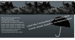
This project was very similar to the other CD cover. This time though, we were assigned a song and had to figure out its meaning and put pictures to symbolize the meaning. My song I was assigned to do was Knockin’ on Heaven’s Door by Warren Zenon. This song was remade many times but this guy died a few days following the day he recorded this song. Knockin’ on Heaven’s Door was about someone is basically sick of life and is ready for death. For the front cover I used a picture of a door opening up to heaven. I then took this picture and I put it in Photoshop to filter it. After that I pasted it into Publisher and made it brighter so it wasn’t so dark. Then the man that is about to walk through the doors, I got off google images. He was originally walking with a girl but I cropped her out and I made him darker and pasted him into the picture. Then the back of my cover was the same as the back of my other CD cover. For the inside of the CD over I used a dark cloud spanning across the top of it because it said how it was like a dark cloud coming over him. To edit the cloud, I erased the background and made it darker. Then I set the background as transparent so it would only be the cloud. To make sure it wouldn’t come out with pixels, I pasted the image twice and put them together. I also put an umbrella in there to like symbolize death as a door coming. For the umbrella I edited by putting it in Photoshop and making it black with a red outline and a white handle. Then I make the background I put a blackish grey color to give it a sad feeling.
Inside
If I were to change anything about it, it would be my front cover to the CD. I would change it so the picture wasnt such a literal meaning of the song. I would also put more pictures and arrange the lyrics inside the CD cover in a different way because I feel like it is too plain. I would also change the background color of the front and back cover because it came out sketchy.
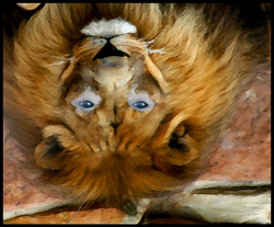
For this project, I took a picture of a lion’s face off of Google. I moved the picture into Photoshop. I also added a picture of Hanna into Photoshop. I scaled the picture of Hanna’s face so that the eyes looked proportional when I morphed them onto the lion’s face. I used to cloning tool to clone Hanna’s eyes onto the lions face. Then I smudged the skin and the lions fur so it looked like the eyes were supposed to be there. Then keeping it in Photoshop, I filtered the picture.
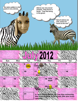
For this project we have to make a whole calendar for the year of 2012. July is the first month we are going to do because the bottom half is matched up with the top half in Microsoft Publisher. For each month I am using a animal, and then morphing my friends Hanna’s face onto the animal. For July I picked zebra as my animal. I found grass online and I edited it in Photoshop with the poster edges filter. Then I edited the zebras in Photoshop too. My sky is just a rectangle colored blue. I got my clouds from clipart and then I changed the color of them. For Hanna’s face I made the color sepia and I colored her eyes blue. In Photoshop I used the clone tool, and cloned Hanna’s face onto the zebra. For the background of the bottom half of the calendar I used zebra stripes. I used pink zebra stripes and black and white zebra stripes. I put the two different patterns into paint and put them side by side so that it was like it was one pattern. In Photoshop I blended the two together. I put them in quadrants on the background so the picture didn’t have any pixels. For the text, I put facts about zebras, and for the text at the bottom I put some facts about Hanna. My moons were made in paint by just coloring a circle yellow. Then for the firework on Independence Day, I cropped it and put it in Photoshop and filtered it with poster edges.
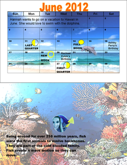
This is the back side of the July calendar. The June calendar and the August have to be switched positions, so that when you fold it, the June lines up with the June picture and the August picture matches up with the August calendar. For the June calendar picture I used a beach scene. I put the picture in Photoshop and filtered it and I also morphed the dolphin in the water. It was also too dark, so when I put it back in Publisher, I lighted it. Then when I printed the picture out I realized it had pixels so I just made the picture smaller. To make the moon phases, I used the same ones as before.
For the August picture, I used a scene from the bottom of the ocean. I put the picture in Photoshop and filtered it. I also lightened it when I put it back into Publisher. The picture was also very large so I didn't have to worry about any pixels. For the fish with Hanna's face on it, I filtered it and made it very small. But before I did that, I made Hanna's face have a blue tint to it in Picnik, a photo editing site, so that it would match with the colors of the fish. I morphed Hanna's face on the fish in Photoshop. Then my writing was just facts about fish.
For the August picture, I used a scene from the bottom of the ocean. I put the picture in Photoshop and filtered it. I also lightened it when I put it back into Publisher. The picture was also very large so I didn't have to worry about any pixels. For the fish with Hanna's face on it, I filtered it and made it very small. But before I did that, I made Hanna's face have a blue tint to it in Picnik, a photo editing site, so that it would match with the colors of the fish. I morphed Hanna's face on the fish in Photoshop. Then my writing was just facts about fish.
