Term 1
Magazine Advertisement
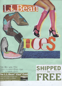
The project that we were assigned to do was to create a magazine advertisement for an event or product. Our advertisement had to convey line, color, balance, and emphasis. We were given scissors, variety of magazines, colored pencils, crayons, paper, and glue sticks. We picked a magazine ad that would guide us on how we wanted to have our ad set up. My product that I chose was LL bean shoes. I used a mixture of magazines to find all different pictures of shoes. I then cut out the logo for LL bean, letters, a woman wearing shoes, blue strip, a “shipped for free” label, and a LL bean visa card. I took my piece of paper and arranged the shoes and labels on the paper. The shoes were set up to form an S and were used to be the S in the word shoes. The letters H, O, E, and S were placed on the side of the S to spell out the word shoes. I used the blue strip and put it under the word shoes so that the word would be balanced out. I then put LL bean sign above the word shoes and on the side of it I put a woman wearing shoes. The woman’s shoes were place so that the bottom of them would touch the word shoes. I put the two other labels at the bottom with contact information in order to create balance on each corner. I used a clash of warm and cool colors on my advertisement to make things pop. I asked the two people on the side of me during the project to help me. They gave me advice on where place things so that the ad would make sense and if was easy to tell what I was advertising. Lastly, when I figured out my design, I glued everything down. During this project, I learned that you have to take time and set up things before you have a final product. Also that you can always change something to make it better. If I were to do this projcet again, I would make a few designs and then pick the one I like the most, instead of just using my intial design.
Window Flyer
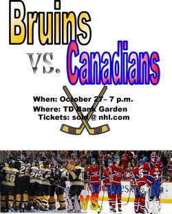
For this project, we were assigned to make a flyer. We had to use Microsoft Publisher to create our flyer. First, we had to pick an event to use for our flyer. I chose to do the Bruins vs. Canadians game for this upcoming season. The first thing I did was make the words Bruins vs. Canadians. I made these words with word art. The colors I used for the inside of the words are each team’s color and the word vs. I put as a generic color. Next I put when, where, and where the tickets are sold. Then I put a picture of each team on the bottom to balance out the top and bottom. After putting this on the flyer, I realized there was a lot of white space, so then I used a clip art of hockey sticks and put it behind the words when, where, and tickets. While doing this project, I learned that sometimes it looks better on the computer then it does when it’s printed out. If I were to do this project again, I would move the stuff around before I pick my final design.
We also learned how to '2 up' today which means making two flyers fit in a one page of paper. First we had to switch the paper size to 5.5" by 8.5". Then we had to shrink the text down to fit inside the 5.5 by 8.5 page. After that we had to go to print and make the page landscape so that two flyers on one peice of paper. Then we printed it.
We also learned how to '2 up' today which means making two flyers fit in a one page of paper. First we had to switch the paper size to 5.5" by 8.5". Then we had to shrink the text down to fit inside the 5.5 by 8.5 page. After that we had to go to print and make the page landscape so that two flyers on one peice of paper. Then we printed it.
Front Side
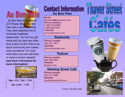
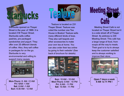
For this project, we had to make a brochure for something on Thayer Street. With our assigned group, we went to Thayer Street and researched our topic. My group was assigned to do cafés on Thayer Street. Our group went into a few different cafés and took pictures and did research. The few cafés I chose to put on my brochure are Au Bon Pain, Starbucks, Tealuxe, and Meeting Street Café. I decided to put the name of the café on top of each page with a picture behind, on the side, or below each title that represented the café. Next, I wrote a paragraph explaining some things of the about the café. Then at the bottom of the column, I put a picture of the café and wrote the store hours. Lastly, on the back of the brochure I put all the contact information for each café.
Back Side
If I were to change anything about this project, it would probably be how I set up my brochure. I would try to make it more please to the eye, considering it is kind of dull and not eye catching. During this project we learned how to make words more creative by using a program named Photoshop. Also if I were to do this project over again, I would also use Photoshop to edit pictures and words to make them more creative.
